Why you shouldn’t come back with two mockups
Hear “Can we make it bold, but simple?” at your first design review and you’ll probably freeze. You go back and make one bold version and one simple version — and at the next review hear, “Neither, actually.” Korean design consultant Woody of Woody Design Lab heard this often as a reviewing designer and concluded it isn’t an impossible request. It comes from someone who hasn’t set priorities. They want both and don’t know which to protect first. The designer’s job isn’t two mockups; it’s surfacing that priority. Here are four questions for handling vague design feedback.
Question 1: “If users remember just one thing on this screen, what is it?”
If the answer is one thing, that’s the center of the screen and everything else is a candidate for removal. The trouble comes with two answers — “price and reviews.” That’s the real reason the screen felt cluttered: the requester wanted both up front. Once you hear it, the conversation shifts from design to deciding what goes first.
Question 2: “Can you show me one screen you think looks bold?”
This turns an adjective into a reference. “Bold” means different things to different people; one example aligns the picture. Tellingly, the screens people bring are usually simple — one strong background color, one large photo. What they wanted wasn’t more; it was one thing done loudly. People can’t explain it, but they can show it.
Question 3: “Can you pick one thing we could remove from this screen?”
Simplicity is a decision to subtract, yet review comments are almost always additions: a banner here, an icon there. So ask them to choose something to remove. The first answer is “we need all of it,” but ask for just one and they’ll pick. Someone who removes once starts proposing removals themselves.
Question 4: “Who is the most important user?”
Asked last, it lands hardest. The first three organize what’s inside the screen; this one sets the standard from outside. In a B2B admin tool, bold means numbers you can read at a glance. In B2C commerce, bold means photos that make you want to buy. Same word, different definitions.
An adjective becomes a four-line brief
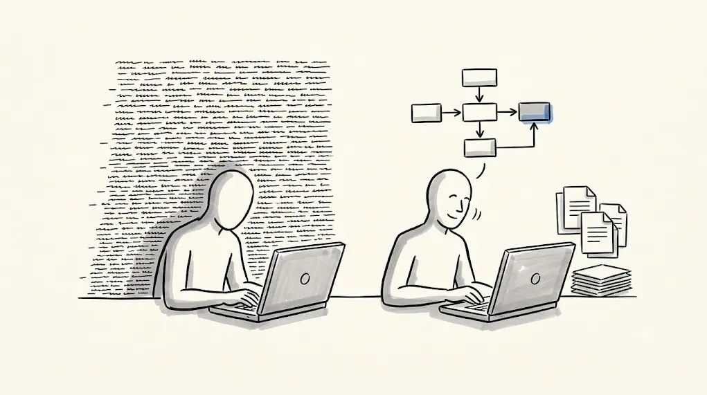
None of these questions can be answered with “yes,” “no” or “looks good.” People must choose, show or subtract. The answers form a requirements document: one core message, one reference, one element to cut, one target user.
The same tool for marketers and planners
Ad creative, landing pages and product pages attract the same adjectives — “sleeker,” “more impactful.” Agencies can use these questions with clients, in-house teams with executives, to cut revision rounds and leave a record of why decisions were made. As AI floods teams with options, criteria for choosing what to keep matter more, and turning individual instinct into a repeatable procedure sets a team’s pace. When feedback arrives as adjectives, don’t answer with adjectives: make people choose, show and subtract.