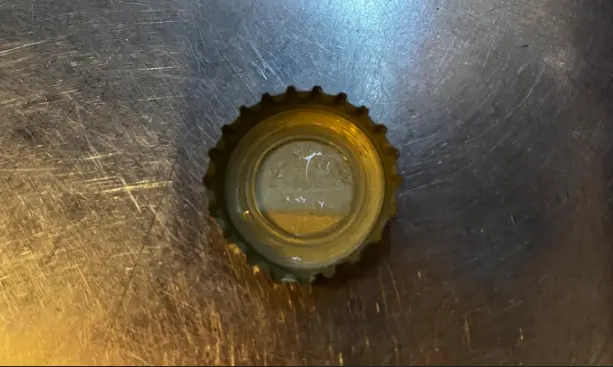
Design hidden in a bottle cap
Korea’s favorite drinking combination, somaek — beer mixed with soju — comes from two bottles with small metal caps. A Korean UX column by Winternote argues those caps carry decades of refined user experience. UX isn’t only screens; physical objects carry layer upon layer of design decisions too. It’s a textbook case of invisible UX.
Twenty-one teeth: a number found through failure
The cap you pry off with a bottle opener is the crown cap. When American inventor William Painter introduced it in 1892, it had 24 teeth. That sealed so tightly that bottle necks often cracked under pressure. Cut the teeth to 20 or fewer, and carbonation leaked or the opener slipped.
After years of trial and error, 21 became the answer. The column explains that 21 teeth balance symmetrically and spread internal pressure evenly, and that the number was cemented as a global standard through the German industrial standard DIN 6099 in the mid-20th century. Three requirements meet in that number:
- Reliability: it keeps the carbonation and quality in.
- Safety: the bottle neck doesn’t crack.
- Affordance: the opener grips the cap precisely.
That is why beer and soft drink bottles still use 21 teeth more than 130 years later.
The split ring: a safety feature born from recycling
Until a few years ago, twisting off a Korean soju cap left a metal ring around the bottle neck. That aluminum ring was hard to remove during washing, reducing how often glass bottles could be reused. Since December 2020, caps have used a double perforation so the lower ring splits in two and comes away with the cap.
The change made for recycling also fixed a user pain point: people used to scratch or cut their hands on the leftover ring’s sharp edge. With the ring removed along with the cap, that risk disappeared. Eco design became preventive design.
Great design doesn’t announce itself
The intuitive way an opener finds the cap, and a recycling fix that also protects fingers, are experiences refined until users don’t notice them at all — so they can focus entirely on the moment.
What brands and marketers can take away
- Sustainability changes stick when users gain something too: like the split ring, eco improvements that add convenience or safety meet little resistance. If you redesign packaging, design and communicate the user benefit.
- Standards are a record of failure: 21 emerged from cracked necks and flat drinks. Complaints and return reasons are the raw material for your next standard.
- Invisible experiences make good stories: the reasons behind details customers take for granted are strong brand content.
The same principle drives renaming “ugly apples” as “dimpled apples” and Duolingo’s forgiveness-based retention UX: good experiences remove the need to think.