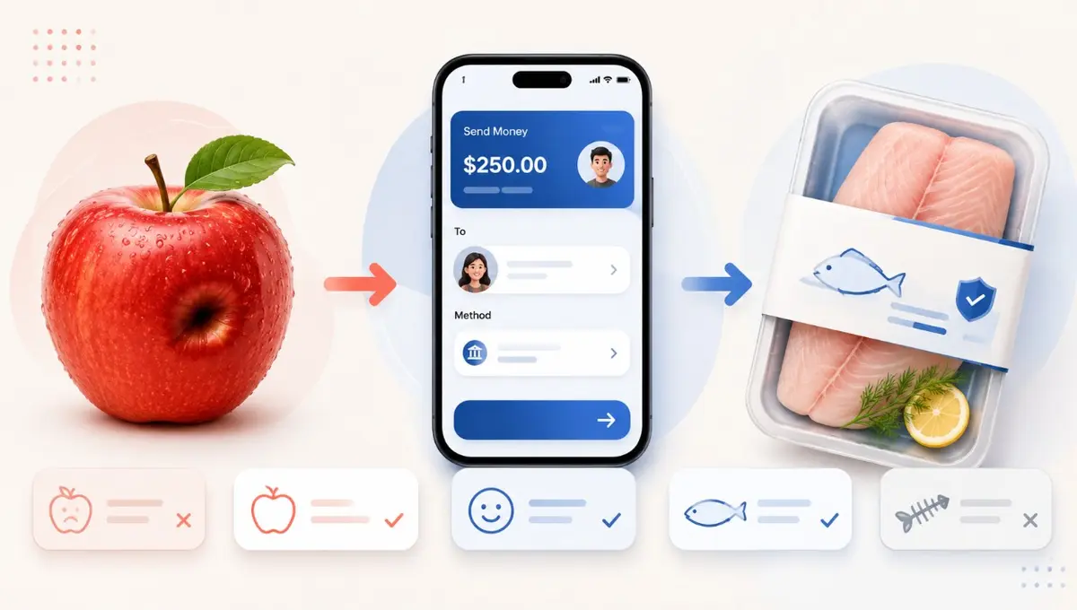
A rename that multiplies revenue is not a copywriting trick. It is microcopy that identifies and removes a user's psychological friction — a UX decision that rewrites how people categorize the thing in front of them.
Dimpled apples: reframing a defect as character
Hail-marked or lightly scratched apples used to be sold in Korea as "ugly apples" or "blemished fruit."
The old UX problem
The words trigger an automatic inference: it must taste worse, be less fresh, or have something wrong with it. Even at a low price, that unease blocks the finger heading for the buy button.
After the rename
Calling the same mark a "dimple" flips the mental model. The product stops being defective and becomes "slightly imperfect outside, identical inside, better value." One supplying farm's revenue grew from ₩8 billion to ₩30 billion within two years of the change. Sweetness and texture were unchanged. The emotional value moved from negative to positive, and conversion followed.
'Bone Removal Lab': dropping supplier vocabulary
The market already had "mackerel fillet" and "boneless mackerel," and sales were unremarkable. "Fillet" is supplier language; shoppers are not chefs, and the word alone does not promise zero bones. Even "boneless" leaves the worry about small bones when feeding a child.
One company renamed the brand outright to "Bone Removal Lab." The credibility implied by "lab" plus the literal phrase "bone removal" drove the cognitive load of evaluating the product close to zero. Naming the customer's anxiety beats naming the product category.
Toss: everyday words instead of banking terms
Terms like "remittance," "withdrawal," "interbank transfer" and "time deposit" create distance and fear — what if I press the wrong button and my money disappears? Toss replaced them with "send money" and "receive money," making the app feel like a counterpart that understands you rather than a system that judges you.
Two principles
A name is an interface
UI is not only visual. A good name replaces explanatory paragraphs, tooltips and long detail-page scroll. It is the cheapest way to reduce screen complexity.
Read the user's mental model
Stop asking what feature you built and ask what image the word creates in the reader's head. Worth re-asking every time you name a dashboard menu, a button, or a product: is this an "ugly apple" written from the supplier's point of view?
For turning that instinct into a repeatable procedure, see 'Skill' for Product Designers and PMs.
Adapted from a MobiInside edit of a Brunch post by Winternote.