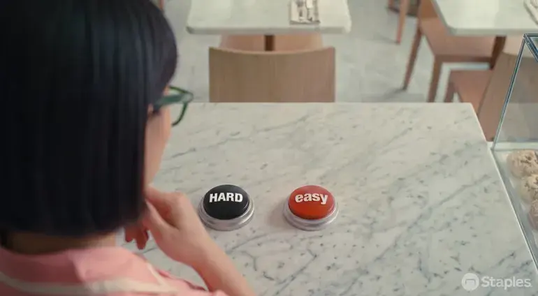
Staples' Hard Button campaign gives its famous Easy Button a black alter ego. Ads show managers facing problems such as missing restroom supplies or embarrassing printing errors, then contrast those “hard” outcomes with the simplicity of using Staples' workplace services.
The B2B perception problem behind the Hard Button
Staples is widely known for stores, ink and toner, but says services such as furniture consultation, break-room and janitorial supplies, and same-day delivery remain undervalued. In the company's framing, it has an awareness advantage but a perception problem. The campaign keeps a familiar asset while expanding what the brand can mean.
Media includes YouTube, Hulu and Netflix, shorter LinkedIn and Meta creative, out-of-home placements in travel hubs, corporate-building signage, display ads and collateral for sales teams. Every channel uses the same Hard vs. Easy contrast.
Why Staples designed a platform instead of one campaign
Enterprise services are too broad for a single product message. By changing the workplace problem, Staples can explain printing, furniture, supplies and delivery through one repeatable story. Like The UPS Store Built Its First Brand Character — a Device for Unifying Franchisee Messaging, a character or device can make a complex service portfolio consistent across touchpoints.
The test for reviving an old brand asset
Nostalgia alone does not explain a changed business. The asset must organize a current customer problem quickly. The Hard Button dramatizes the cost of the difficult route, allowing the Easy Button to return as a bridge between past recognition and present B2B capability.