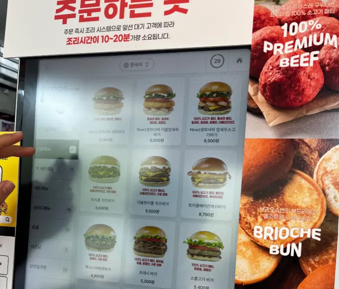
Coffee in the morning, the cinema on the weekend, hospitals, government offices, unstaffed convenience stores. Everywhere you go, a rectangular screen greets you first. Kiosk UX is now the opening touchpoint of the in-store experience — and, for some people, a wall across the entrance.
The word originally meant "a place that makes shade"
Kiosk comes from the Persian kūshk, meaning pavilion. In the 13th century it described an open structure in a palace garden; in Europe it became a small newsstand; today it names the unattended terminal. The origin is an open space anyone could approach and rest in.
Early on, kiosks were a genuinely attractive innovation — operators wanted lower labor costs, customers wanted contactless convenience, and everyone wanted fewer order errors. The pandemic accelerated adoption into the mainstream. The problem is that this transition has not been equally open to everyone.
The barrier is not font size
Older customers struggle with small text and layered screens. Children get stuck at payment. Wheelchair users often cannot reach a screen mounted for standing adults. For blind users, a touchscreen is an invisible wall.
But the deepest problem sits before accessibility: anxiety about making a mistake. Ordering from a person lets you ask when you are unsure. In front of a machine, the consequences of getting it wrong belong to the user. How do you cancel a mis-tap? How do you go back? Did the payment even go through? The queue behind you amplifies all of it. That is how a machine for ordering becomes a machine that keeps testing whether you are adapting well enough to a digital society.
The irony is a design habit that equates more features with better service — recommended items, membership signup, side upsells, review promotions. As screens get busier, users get more lost. Good UX does not make users smarter; it makes them think less.
Four rules for a kinder machine
1. Put the first screen on an information diet
Many kiosks open with banners, popups, signup prompts and upsells at once. Users want one thing first: to find what they came for.
2. Minimize questions
Show "dine in" and "takeaway" large and first, then keep an unbroken path from item to options to payment. People are not here to explore an app; they are here to complete a transaction.
3. Separate "pay" from "cancel everything"
Older users tense up less about small buttons than about pressing the wrong one. Targets should be large and generously spaced — and a "cancel all" button sitting friendly and close to "pay" is a horror story for anyone who just spent five minutes building an order.
4. Write conversational microcopy
"Add a drink?" and "Change your fries size?" beat system phrasing like "select additional options" or "customize toppings." Good UI never sends users looking for a manual.
Choice matters more than technology
Hardware accessibility belongs in the plan too: screen angle set for a seated line of sight, payment terminals within a child's reach, audio guidance and headphone jacks for blind users. But more important than perfect technology is leaving a choice. The moment a digital path becomes the only path, technology stops being convenience and starts being exclusion — which is why some stores keep a staffed register open beside the kiosk.
The point is not digital transformation but digital care. The best machine is not the one packed with the newest technology; it is the one a first-time user can complete without any explanation. For how a single word can change what users decide, see From 'Ugly Apple' to 'Dimpled Apple' — Naming as an Interface, Not a Slogan.