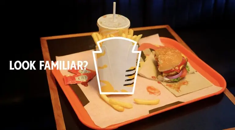
This June’s Cannes Lions Grand Prix in Print & Publishing went to an ad with no logo, no product name and no ketchup bottle. Heinz’s “Look Familiar?” simply showed a fast-food fry box. It is a textbook case of how brand consistency compounds over time.
The fry box was the Heinz logo
Created by Rethink Toronto, the campaign started with an observation: the silhouette of a fast-food fry box mirrors Heinz’s 150-year-old keystone logo. Millions of fry boxes handed out every day had been giving Heinz free logo exposure.
Execution and results
The work ran as out-of-home across city centers and transit hubs in the U.S., Canada, Mexico, the U.K., Brazil, Germany, the UAE and China, and a partnership with Uber Eats surfaced the message at the moment people ordered fries.
- Reach of 42% in the UAE and 33% in Toronto
- Uber Eats in-platform sales up 222% in the U.S.
- Canadian household penetration up 3.38 points to 10.31%
- U.K. volume market share up 4.37 points
- 150+ media mentions, with “Heinz” named in 86% of headlines
Why it worked happened long before the ad
For a silhouette to read as Heinz, the keystone shape must already be fixed in people’s memory, and that came from barely changing the logo for a century and a half. Rethink didn’t create a new asset; it found one Heinz had been building all along.
Every repeated exposure lands on top of the memory built by earlier ones, like interest on a balance. The same principle shows up in Six Years of the Same Jingle.
Redesigns burn the interest
Tropicana: sales down 20% in two months
In 2009, Tropicana replaced its iconic orange-with-a-straw image with a glass of juice. It looked sleeker, but shoppers couldn’t find their usual juice on shelf. Sales dropped 20% in two months, and the old design came back.
Gap: reversed in six days
On Oct. 4, 2010, Gap unveiled a Helvetica logo with a shrunken blue box. After a fierce backlash, it reverted on Oct. 11.
Neither asset failed because it was outdated. Both brands reset familiarity that was still compounding.
Questions to ask in your next rebrand meeting
- Run a logo-removed asset audit: strip out your logo and name. What still reads as you? Color, shape, typeface, tone of voice, sonic logo, packaging silhouette. Most lists are thinner than expected.
- Ask: “How many years of recognition does this change throw away?” The longer an asset has been repeated, the more interest you burn by changing it. Campaign themes and seasonal creative can change freely. Heinz made an entirely new ad but left its logo untouched.
- Accept that consistency won’t show up in quarterly numbers: new creative feels like progress, but the quiet interest earned by repetition is what eventually makes a brand recognizable without its logo.
For another Cannes-winning take on brand positioning, see An Ad About Not Running Ads Won the Cannes Grand Prix.