A shooting star replaces the apostrophe
Children’s apparel brand Carter’s launched a refreshed brand identity and a campaign called “Watch Them Glow” on September 15. Built on a promise to “let every child’s light shine,” it aims to connect with young millennial and Gen Z parents while keeping the brand’s 161-year legacy. The new logo — Carter’s first since 2000 — swaps the apostrophe for a shooting star symbolizing the light each child brings, with lettering inspired by earlier logos. It’s the centerpiece of the Carter’s brand refresh.
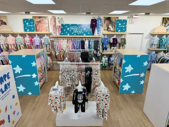
The 60-second hero spot opens on the logo, then moves through home-video-style clips as a voice-over says: “The world spends years teaching them to fit in, but for generations, Carter’s has had the honor of making clothes that let children shine.” It runs on CTV platforms including Nexxen, Roku, Disney+ and Hulu, plus digital and social. The identity rolls out across channels this year, with retail, product and packaging updates in 2027.
Why self-expression
Pew Research Center data showed nearly half of U.S. parents say they’re raising their children differently than they were raised, with acceptance and encouraging children to follow their own path as key themes. “Today’s generation of parents are really embracing this notion of self-expression,” said CMO Sarah Crockett. Because Gen Z and young millennial parents weigh brand values more heavily, Carter’s leaned emotional — while defining value as trust, quality and style at the right price, not price alone.
Social and creator strategy
- Social overhaul: refreshed creative, tone, product storytelling and community narratives.
- Light Makers creator program: celebrating people working to give children the best outcomes, launching this year in the U.S. and Canada.
- Glow Grants: up to 15 grants in the first year for select Light Makers members.
Crockett noted that parents once turned to experts for advice, while today social media personalities act as peer experts; Carter’s wants to be a trusted, encouraging voice for overwhelmed families. It continues support for Boys & Girls Clubs of America and added a partnership with Outward Bound.
Marketing investment and results
Parent Carter’s, Inc. increased marketing investment this year, and net sales rose 5% in Q2 2026 — gains CEO Sharon Price John attributed to improved marketing. Crockett warned that businesses often get stuck in demand capture and neglect building consideration, calling the refresh “a job to be done over multiple years.”
Takeaways for marketers
Heritage rebrands persuade when they reinterpret rather than discard the past; Carter’s kept lettering cues from old logos and added one symbol to carry a new promise. Compare Jif reworking its logo to escape the PB&J box and Hanes’ bold rebrand at 125 to see different ways heritage brands speak to new generations. And a rebrand doesn’t end at the logo reveal — the promise becomes real only when stores, products and packaging follow.