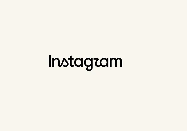
Instagram updated its branding. Platform chief Adam Mosseri shared the first look at the new logo, replacing a wordmark that had been in place for more than a decade.
What Changed
Mosseri's framing: "We updated the Instagram wordmark today, which is more than a decade old and felt dated. We feel the refresh is sharper and more modern, but references the original and has the simplicity and craft that's always made it Instagram."
Instagram also published an overview of its updated brand system, which includes new fonts, icons and formats.
Inside the app, however, it currently appears that only the title at the top is getting an update.
Reactions Split
There were plenty of complaints. Mosseri's announcement posts on Instagram and Threads drew more than 5,000 combined replies at the time of publishing.
The most common criticism was the font: the stylized presentation makes the "r" read like a "z" to many people. A large share of the rest had nothing to do with the logo at all — the recurring complaint that users do not care about updates like this and just want to see posts from the profiles they follow.
Does a new logo matter in the bigger scheme? For regular users, probably not. It could enhance appeal with certain audiences, and a simple presentation change can make an app feel refreshed.
The Real Question Is What Follows
Branding changes rarely arrive alone. The open question is whether Instagram is close to shipping something that aligns with the new display — a bigger update that gives the refresh something to stand on.
Worth noting that Instagram has been investing in creator tooling lately. See Meta Opens Its Creator Studio App to All U.S. and Canada iOS Creators for the direction of travel.
What Brand Teams Should Do Now
Setting the logo debate aside, there is real housekeeping here: it is time to refresh the Instagram links and icons embedded across your assets.
The surface area is wider than most teams expect.
- Social icons in website headers and footers
- Social link blocks in email newsletter templates
- Business cards, print collateral, in-store POP
- Press kits and brand guideline documents
- Co-marketing assets distributed to partners
- App store screenshots and social proof sections on landing pages
None of this has to happen at once. But sequencing replacements by impression volume is worth doing. Assets still carrying an old icon read, over time, as unmaintained.
One more thing: if your brand guidelines have no rule for handling third-party platform icons, add one now. Platform branding will change again.
What Marketers Should Take From It
Negative reaction to a rebrand is close to the default. Much of the criticism in those 5,000+ replies was not about the logo at all but about longstanding grievances with the app. If you are preparing a rebrand, do not treat initial reaction as a success metric. Announcement channels are where complaints collect.
A wordmark change only works as part of a system change. Instagram bundled fonts, icons and formats into a "brand system" because swapping a logo alone does not shift perception. A new logo surrounded by assets built on old rules ends up looking more dated, not less.
Something has to back the change up. If new branding turns out to be a display change with no product change behind it, the question "why did you change it?" has no answer. That is why rebrand timelines get attached to product roadmaps.