In an investor meeting, "our MAU is growing 20% month over month" carries less weight than founders expect. Any company can produce that number for a while by spending on marketing.
"40% of the cohort that signed up six months ago still pays weekly" is much harder to argue with. Growth can be purchased. Retention cannot be manufactured without the product genuinely delivering value.
Which is why experienced investors look for the cohort retention chart before the up-and-to-the-right graph.
Cohort Tables Reveal What Averages Hide
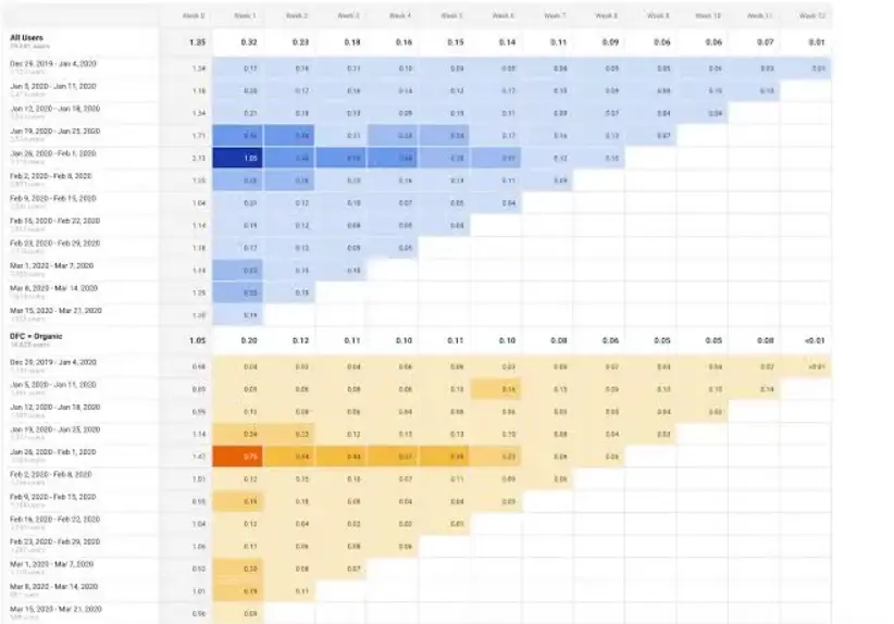
Cohort analysis starts by grouping users by signup (or first purchase) date. January signups form one cohort, February another. Record what percentage remains active as each cohort moves M0 → M1 → M2, and you get a triangular table: rows are signup month, columns are elapsed months, cells are retention.
Three Curve Shapes
Decay: retention slides continuously toward zero. The product is not giving people a reason to return, and growth in this state is water into a leaking bucket.
Flat: after initial churn, the curve levels off. The users who remain have made the product a habit.
Smile: retention flattens and then rises again. Churned users return as the product improves, or expansion occurs. a16z has analyzed this as a new pattern among AI-native services like ChatGPT where capability improves rapidly.
Contract the Definition of "Active" First
Before building the table, define active. Treat a simple session as activity and the curve looks good while proving nothing.
- Commerce: repeat purchase
- SaaS: core feature execution
- Content: completed consumption
The benchmark action must connect to the product's value hypothesis, and stating that definition in the deck is what makes investors trust the numbers.
Benchmarks — Where Does Your Curve Sit
Retention has no absolute standard. The same 30% can be excellent or fatal depending on category.
Six-Month User Retention (Lenny's Newsletter — good/great)
| Type | Good | Great |
|---|
| Consumer social | 25% | 45% |
| Consumer transactional (Airbnb/Lyft-style) | 30% | 50% |
| Consumer SaaS | 40% | 70% |
| SMB and mid-market SaaS | 60% | 80% |
| Enterprise SaaS | 75% | 90% |
The more organizational the customer and the higher the switching cost, the higher the bar.
Revenue Retention: NRR
From the same survey, 12-month NRR benchmarks run 100%/120% for bottom-up SaaS, 90%/110% for SMB and mid-market, and 110%/130% for enterprise SaaS.
Market data lines up. SaaS Capital's 2025 survey put the median NRR at 102% for private SaaS in the $25K–$50K ACV band, with the top quartile at 111%. Companies with higher NRR grew faster than the survey's overall median growth rate of 24%.
NRR above 100% means revenue holds even with zero new customers — to an investor, a floor under growth.
Mobile Apps Use a Different Ruler Entirely
Benchmarks combining 2025 data from AppsFlyer, Adjust, and data.ai put median D1 retention at 25%, D7 at 8%, and D30 at just 4%. Top performers sit at 5–8% on D30, and social — the strongest category — has a median D30 of 12%.
Which means a double-digit D30 is itself a top-tier signal. "Our D30 is 15%" outperforms dozens of market analysis slides.
For AI products, a16z projects leaders can reach 150% NDR at scale ($500M+ ARR) and cautions against applying legacy SaaS benchmarks unchanged.
What Investors Read Off the Curve
First: Does the Curve Flatten
This is the single most important check. A flattened curve is the hardest-to-fake evidence of product-market fit — proof the product delivers sustained value to some group.
- The height of the plateau indicates how large an asset you can claim in the market.
- The time to reach it indicates onboarding and activation efficiency.
If the curve keeps sliding, then however large current revenue is, that revenue is a function of marketing spend.
Second: Are Recent Cohorts Better Than Older Ones
If the March cohort's M3 retention exceeds the January cohort's M3, product improvements are actually working. This "cohort improvement" narrative is the strongest story available to early companies whose absolute numbers still miss benchmarks.
a16z pushes further. In AI products full of free trials and curiosity signups, M0-anchored curves get distorted by "AI tourists," so they recommend anchoring at M3, where only genuine users remain, and judging long-term quality by the M12/M3 ratio. In the same spirit, track acquisition cost per M3-retained customer rather than cost per signup.
Third: The Floor Under LTV
a16z states plainly that retention is the most important input into a five-year LTV/CAC calculation. Once the plateau level is known, cumulative revenue per cohort can be plotted, and payback period follows automatically.
So the retention curve is not a product metric — it is the foundation of the entire unit economics model. When an investor asks for raw retention data, it is not because they distrust the LTV in your deck; it is because they intend to recompute it themselves.
Three Common Mistakes
Hiding decay behind blended metrics. Total MAU or overall average retention looks fine while new signups grow, but splitting by cohort often reveals each class dying quickly. Investors always re-cut by cohort, so a narrative built on blended numbers collapses in diligence.
Defining activation loosely. "Login equals active" does not survive scrutiny.
Lumping paid and free, organic and paid into one line. Separating curves by channel and plan reveals which acquisition sources bring users who stay — which is also the basis for marketing budget allocation.
Three Slides Are Enough
- Monthly cohort table (heatmap) presented alongside the activation definition
- Retention curves for key cohorts with the plateau marked
- Cumulative revenue per cohort (or NRR) with the CAC payback line
Add the improvement narrative — later cohorts sit above earlier ones — and the retention section becomes a stronger investment argument than the market-size slide. If your numbers miss benchmarks, do not hide them; presenting root-cause analysis and improvement experiments builds more credibility than a gap ever costs.
A Marketing Extension
This logic is not confined to fundraising. It applies directly to marketing budget allocation.
Leaning on averages clouds judgment — exactly the problem identified in why customer journeys built for an average customer fail. And more dashboards do not produce better decisions, the point behind treating data as uranium rather than oil. A report that changes no decision is waste — cohort tables included.
Bottom Line
The cohort retention chart is the most honest document a startup has. Growth rate can be inflated with spend and revenue with one-off contracts, but the share of users still present after time cannot exist unless the product delivers value.
Before opening the next deck, open the cohort table.